How to Keep Branding Consistent Across Social Media Platforms
.svg)

Brand consistency is what makes someone recognize you in a crowded feed before they even read a word. It is also what turns “random posts” into a brand people trust. The catch is that every platform presents your identity differently: circular crops, header safe zones, dark mode, different typography, and different social norms.
This guide gives you a practical system to keep branding consistent across social media platforms (without forcing every channel to look identical).
What “consistent branding” actually means in 2026
Consistency is not copying and pasting the same creative everywhere. It is aligning the parts that should be stable, and intentionally adapting the parts that should flex.
Think in two layers:
- Brand anchors (must stay consistent): logo or face, core colors, typography choices, icon style, tone of voice, brand promise, and “what you’re known for.”
- Platform adaptations (should vary): format (Reels vs threads), caption length, hashtags, humor level, posting cadence, and content packaging.
If you only standardize visuals, you risk sounding different everywhere. If you only standardize tone, your look becomes inconsistent and less recognizable. You need both.
Step 1: Build a cross-platform brand kit (your single source of truth)
Before you tweak profiles or templates, create a brand kit that a teammate, freelancer, or future-you can follow.
At minimum, include:
- Logo / mark usage: primary, secondary, icon-only, clear space rules.
- Color system: primary, secondary, neutrals, background colors for light and dark contexts.
- Typography rules: headline font, body font, fallback fonts, and when to use each.
- Image style: photography rules (lighting, backgrounds), illustration style, or how screenshots should be framed.
- Voice and tone: 5 to 10 “we sound like this” descriptors, plus 3 to 5 “we never sound like this.”
- Message pillars: 3 to 5 repeatable themes (the topics you want to own).
- CTA library: consistent phrases for “book a call,” “download,” “join,” “try,” “DM us,” etc.
This matters because most inconsistency comes from small ad hoc decisions: a slightly different blue, a new font in a rush, a “temporary” slogan that becomes permanent.
Step 2: Standardize your identity surfaces first (profile + cover + bio)
For most people, the profile is the first conversion step: follow, click, DM, or bounce. Consistency here does more than your feed aesthetics.
Profile photo rules that hold across platforms
Pick one primary profile photo or logo mark, then enforce these rules:
- Recognizable at small sizes: if your face or mark is not clear at 32 to 64 px, it will fail in comments and notifications.
- Centered with safe padding: circular crops (Instagram, TikTok, Facebook) punish edge-to-edge compositions.
- High contrast: especially important on dark mode and on compressed mobile displays.
- Limited text: in most cases, skip text entirely in a profile photo.
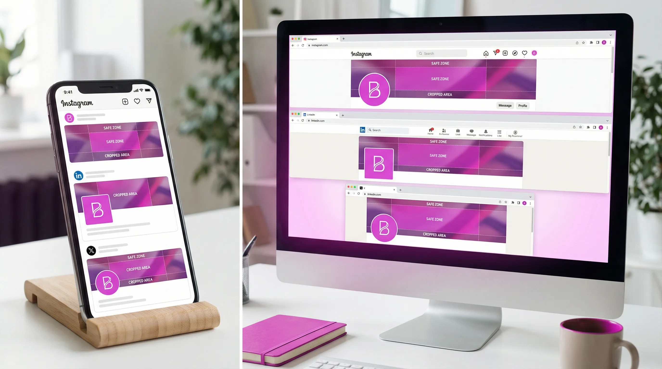
Because each app crops differently, you should preview before you publish. SocialPreviewing was built specifically for this: you can upload a profile picture and cover image, then preview how they render across major platforms (Facebook, Instagram, TikTok, X, LinkedIn) and on multiple devices, side by side.
If you want a quick reference for everything that should be aligned on your profiles, use this internal checklist: Social Media Profile Checklist for a Strong First Impression.
Cover images and banners: the consistency trap
Covers are where brands accidentally diverge because every platform has different dimensions and safe zones.
Common failure modes:
- A headline looks great on desktop, but is hidden behind the profile photo on mobile.
- Your banner CTA is readable on LinkedIn, but becomes tiny on X.
- Your background image changes mood by platform (corporate on LinkedIn, chaotic on X).
A better approach is to standardize the components rather than the exact layout:
- Keep the same campaign message (one headline, one offer).
- Keep the same visual motif (pattern, gradient, illustration style).
- Allow layout changes so text stays inside the safe zone.
To avoid rework, start from current recommended sizes and then preview in realistic device frames. This size reference helps when you are building templates: Social Media Image Sizes: The 2025 Cheat Sheet Every Marketer Needs.
Step 3: Create a template system for repeatable post types
If you design every post from scratch, inconsistency is guaranteed. Templates are how you protect the brand when you scale content.
Start by defining 4 to 8 repeatable formats, for example:
- Educational carousel
- Quote or opinion card
- Product or offer highlight
- Case study result
- Event announcement
- Hiring post
Then lock the rules:
- Grid, margins, and spacing
- Font sizes for mobile readability
- Color usage (what backgrounds are allowed)
- CTA placement (or “no CTA” rule)
- Logo placement (or rule to omit it)
This is especially helpful for freelancers and agencies because it reduces subjective feedback like “make it feel more on brand.” Instead, it becomes: “Use template B, version 2, with headline style 1.”
Step 4: Keep your message consistent, not just your graphics
Visual consistency gets recognition. Message consistency gets trust.
Define your “one sentence” brand promise
Write a single sentence you can reuse everywhere:
- Who you help
- What outcome you help them achieve
- How you do it differently
Then adapt it per platform character limits, but keep the meaning stable.
Build a vocabulary list (and a banned words list)
Brands drift when people swap in near-synonyms that change the vibe.
Examples:
- If you are premium: you might say “strategy,” “craft,” “partners.”
- If you are playful: you might say “build,” “ship,” “make it pop.”
Also define what you do not say (even if it performs): cringe buzzwords, aggressive scarcity language, or anything that conflicts with your positioning.
Match tone to the platform without losing your personality
A practical way to do this is to keep your personality traits constant while changing the delivery:
- Same personality: direct, helpful, slightly opinionated.
- Different delivery:
- LinkedIn: structured, professional, fewer emojis, clearer context.
- X: tighter phrasing, more punch, faster back-and-forth.
- TikTok: casual spoken language, more “showing” than “telling.”
Step 5: Create platform rules so adaptations stay on-brand
Write a one-page rule set for each channel so the differences are intentional.
Good rules are specific. For example:
- Instagram: warm color grading, minimal text on images, prioritize carousels and short captions, always use the same 3 highlight cover styles.
- LinkedIn: neutral backgrounds, proof-first writing (metrics, examples), avoid slang, banners must keep text away from the left side due to profile overlap.
- TikTok: use high-contrast cover frames, keep on-screen text large, hook in first 2 seconds, captions include a single CTA.
- X: high-contrast avatar, banners can be simpler, default to short threads, use consistent sign-off.
This also helps if you manage multiple brands. A B2B SaaS brand and a personal brand can both be consistent, but their rules should look very different.
Step 6: Use approvals and asset management to eliminate “version chaos”
Many consistency problems are operational, not creative.
Avoid the “random folder” trap
If your team is pulling files from old exports and screenshots, you will get drift.
Set up:
- A single folder for current assets (logo, avatar, banner, templates)
- Naming conventions (date, platform, campaign)
- An “archive” folder for old versions
Add one lightweight approval checkpoint
You do not need bureaucracy, but you do need one gate:
- Does it match the brand kit?
- Does it fit the platform safe zones?
- Does it read on mobile?
For visual assets, exporting mockups can speed approvals. SocialPreviewing supports exporting social media mockups, which is useful when you need a client or manager to approve a profile refresh before you push it live.
If you want a workflow outline you can copy, this pairs well with: How Previewing Can Fit Into Your Social Media Workflow.
Step 7: Audit consistency quarterly (and after every rebrand or offer change)
Consistency is not a one-time setup. Platforms change UI, crops shift, and your own positioning evolves.
A simple quarterly audit:
- Check profile photos across all platforms for crop and clarity
- Review covers/banners on mobile and desktop
- Confirm bio language is aligned (offer, CTA, link destination)
- Scan your last 30 days of posts for template drift (fonts, colors, layout)
- Check pinned/featured content is still accurate
This is also where you catch “silent inconsistency,” like an outdated slogan still living on one profile.
Step 8: Measure whether consistency is working
Brand consistency should show up as better recognition and smoother conversion.
Track indicators like:
- Profile visits to link clicks (per platform)
- Follower growth after a profile refresh
- Repeat engagement from the same people (recognition)
- Comments and DMs that repeat your positioning (proof your message is landing)
When you test new visuals, change one variable at a time. For example: keep the photo, change the background color. Or keep the template, change the headline style. That is how you learn what is actually strengthening recognition.
Common consistency pitfalls (and how to fix them fast)
“Everything is consistent, but nothing feels native”
If your posts look copy-pasted, performance often drops. Fix it by keeping brand anchors constant (color, typography, voice), and adapting the packaging (format, pacing, hook style).
“We have templates, but they keep getting tweaked”
That is a governance issue. Lock templates, and create variants intentionally (Template A, A2, A3) rather than allowing one-off edits.
“Our avatar looks great on LinkedIn, bad everywhere else”
Usually a crop and contrast problem. Re-export a square version designed for circular crops, then preview it across platforms before updating.
“Our brand looks different when we enter a new industry or product line”
When you expand, consistency becomes even more important because trust is harder to earn. In regulated or high-stakes categories, cohesive branding supports credibility across ads, affiliates, and community channels.
For example, iGaming operators often need a unified identity across multiple acquisition sources and regions while communicating key trust signals (payments, compliance, security). If you are researching infrastructure in that space, Spinlab’s modular iGaming platform is an example of a product positioned around performance, flexibility, and compliance, which are themes you would want reflected consistently in social messaging and visuals.

A practical “do this next” plan (30 to 60 minutes)
If you want a fast win without a full rebrand:
- Pick your one official profile photo (or logo mark), then preview it across platforms and devices.
- Update all avatars in one session so they match on the same day.
- Refresh your banners using one campaign message, then adapt layout per platform safe zone.
- Rewrite your bio once, then tailor it for length per platform without changing meaning.
- Choose 4 core post templates and commit to using only those for the next 30 days.
Brand consistency is not about being rigid. It is about being recognizable. When your visuals, voice, and profile surfaces tell the same story across social media platforms, your audience spends less effort figuring out who you are and more effort engaging, following, and buying.
.svg)
.svg)


