Social Media Profile Checklist for a Strong First Impression
.svg)

A social profile is often the first “yes or no” moment in someone’s decision to follow you, hire you, DM you, or click your link. That decision happens fast. Research on first impressions suggests people form judgments from faces in as little as 100 milliseconds (Willis & Todorov, 2006). On social media, your photo, name, and bio do that work before your content ever gets a chance.
This checklist is a practical, cross-platform audit you can run in under an hour (and re-run in 10 minutes every month) to make sure your profile creates a strong first impression on Facebook, Instagram, TikTok, X, and LinkedIn.
The quick social media profile checklist (scan this first)
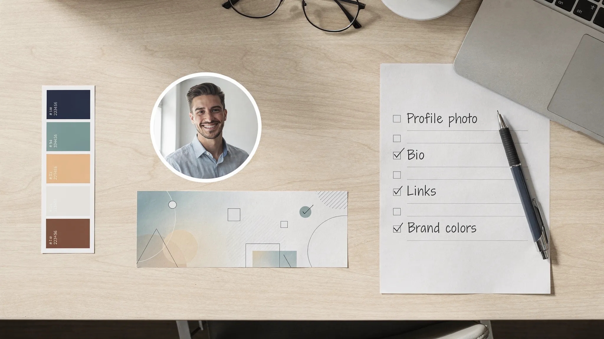
- Profile photo is crisp, well-lit, and readable at thumbnail size
- Photo crop is centered for both circular and square displays
- Cover image/banner is designed with safe zones for mobile and desktop
- Display name matches how people search for you (and is consistent)
- Handle is easy to read, easy to type, and matches other platforms
- Bio clearly answers who you help and what you’re about in one breath
- Bio includes a clear next step (follow, DM, book, subscribe, shop)
- Link is correct, loads fast, and matches the promise in your bio
- Pinned post or featured content supports your current goal
- Highlights (or profile sections) explain your “start here” story
- Brand visuals feel consistent (colors, tone, imagery style)
- Accessibility basics are covered (contrast, legibility, alt text where available)
- Contact methods are correct (email, location, business hours if relevant)
- Trust signals are accurate (role, category, verification if applicable)
- Security is enabled (2FA, recovery email, impersonation checks)
If you only do two things: make your profile photo unmistakably you (or unmistakably your brand) and make your bio instantly clear.
Step 1: Nail the profile photo (it carries the first impression)
Your profile picture is the most repeatedly seen asset across social platforms. It appears in comments, DMs, notifications, tags, and search results. That means it has one job: be recognizable when it’s tiny.
A high-performing profile photo typically has three traits:
- Clarity: sharp focus, no heavy compression artifacts, no clutter.
- Contrast: subject clearly separates from the background.
- Consistency: same photo (or same visual system) across platforms.
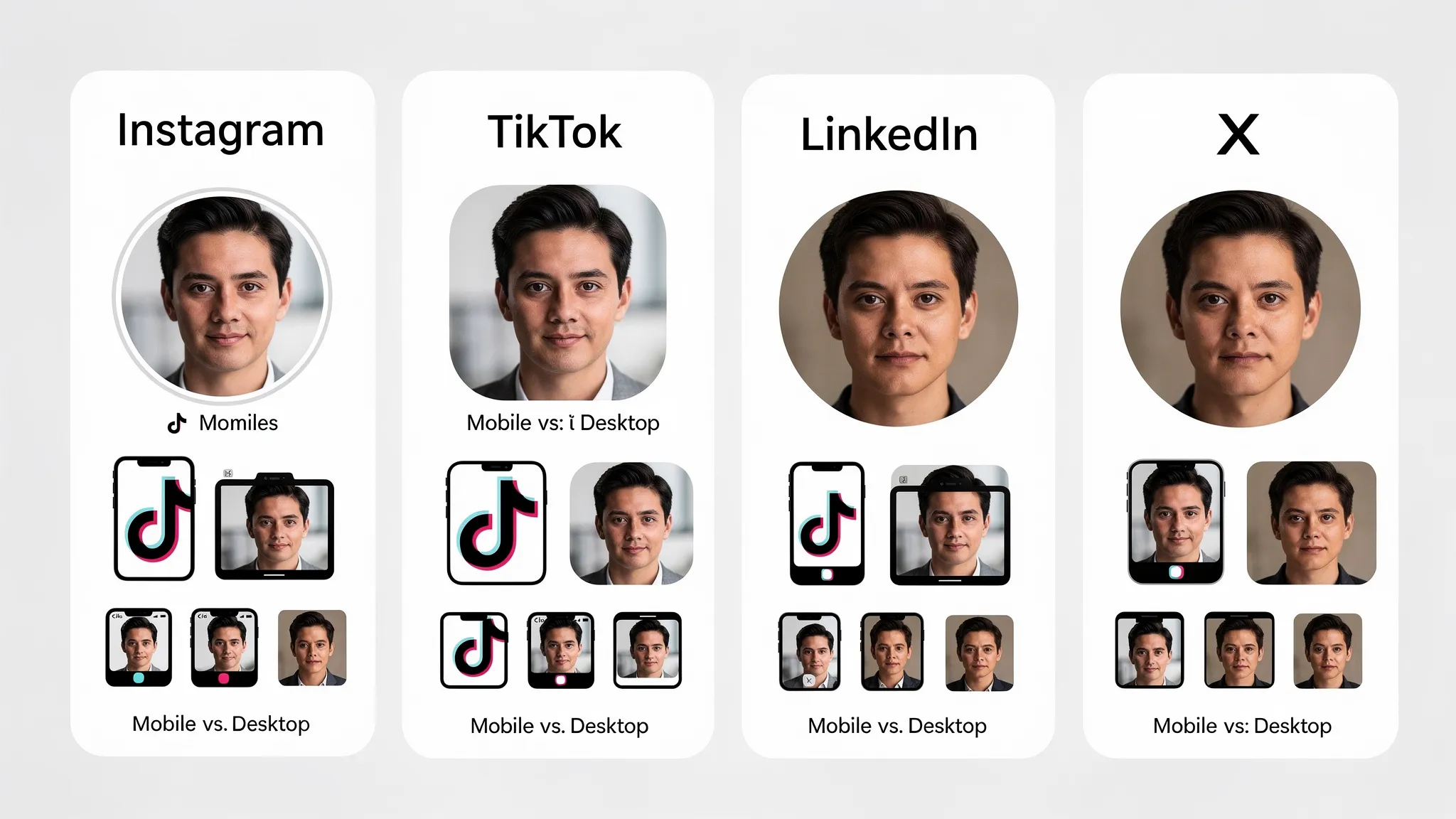
If you’re a creator or professional, a simple head-and-shoulders framing usually wins because it reads well at small sizes. If you’re a brand, a logo can work, but only if it remains identifiable when reduced to a small circle.
The most common problem is not “bad photography.” It’s bad cropping. Many platforms display profile photos as circles, but you upload a square. Anything near the edges can get clipped.
A reliable workflow is to test your photo across platforms and devices before you commit. SocialPreviewing is built for that: you can upload your profile photo and preview how it will appear on major platforms and different devices, then adjust and compare side by side before publishing (Ultimate Guide to Profile Picture Previews).
Step 2: Make your cover image or banner do real work
Cover images are prime “above the fold” real estate, but they are also where formatting errors show up fastest because banners crop differently on mobile versus desktop.
Before you design anything, decide what the banner is supposed to accomplish. Good banners usually do one of these:
- Communicate what you do in a short tagline
- Reinforce your brand world (colors, textures, style)
- Promote a current campaign (podcast, product launch, lead magnet)
- Establish credibility (press logos, social proof, a single strong claim)
Then design with safe zones in mind. Important text should not live near edges. Profile photos can overlap banners on some platforms, and UI elements can cover corners.
If you already have a banner, preview it like you would a landing page: on a laptop, on a phone, and in a smaller “profile header” view. SocialPreviewing lets you upload cover images and check how they render across platforms, and you can export mockups if you need approvals from a client or teammate (A Step-by-Step Guide to Using SocialPreviewing's Free Tool).
Step 3: Standardize your name, handle, and profile identity
People often underestimate how much trust is lost when your identity feels inconsistent.
Display name
Your display name should match how people actually search:
- If you’re a person, use your real name (and optionally a short descriptor).
- If you’re a business, keep it consistent with your website and signage.
Avoid stuffing extra keywords into the name field if it makes you look spammy. Clarity beats cleverness.
Handle
Your handle should be:
- Readable (avoid excessive underscores and numbers)
- Memorable (easy to type from memory)
- Consistent across platforms when possible
If you cannot get the same handle everywhere, keep the differences systematic (for example, add “hq” or your niche suffix consistently).
Category and role fields
On platforms that offer a category (creator, public figure, business category, industry), choose the one that best matches what you want to be hired for or followed for. It improves relevance and reduces confusion.
Step 4: Write a bio that answers “Should I care?” in 5 seconds
A strong bio is not a résumé. It’s positioning.
A simple structure that works across platforms:
- Who you help
- What outcome you deliver
- How you do it (optional proof point)
- What to do next (CTA)
Example (creator): “Helping new designers build portfolios that get interviews. Weekly breakdowns and templates. Grab the free checklist below.”
Example (brand): “Clean skincare for sensitive skin. Dermatologist-tested formulas. Shop bestsellers and routines.”
If your website audience overlaps with SEO and discoverability, it also helps to include a natural keyword or two (your niche, service, or topic). Do it for clarity, not for stuffing. If you want a deeper guide to discoverability, see Optimizing Your Social Media Profile for SEO.
Step 5: Fix your link strategy (most profiles leak clicks here)
Your profile link is often the highest-intent click you will get on social, especially on platforms where links in posts are limited.
Run this mini-audit:
- The link matches your current goal (newsletter, booking, product, portfolio)
- The page loads fast on mobile and looks trustworthy
- The first screen answers “What am I supposed to do here?”
- Tracking is set up if you need it (UTM parameters can help if you use analytics)
Also check link consistency across platforms. If your bio says “Download the guide,” but your link goes to a generic homepage, you create friction.
Step 6: Add “trust scaffolding” with pinned posts and featured sections
When someone lands on your profile, they usually look for shortcuts:
- What do you talk about?
- Are you legit?
- What should I look at first?
Pinned posts, featured posts, and highlights solve this.
A practical set of pinned items (adapt to your platform features):
- Start here: your best introduction post or explainer
- Proof: a case study, testimonial carousel, results thread, press mention
- Offer or next step: your product, lead magnet, booking link, or channel
For Instagram highlights (or similar “featured” modules), keep covers legible and labels obvious. A highlight titled “Stuff” does not help. A highlight titled “Pricing” or “Client Wins” does.
Step 7: Align visuals across platforms without becoming boring
Consistency does not mean identical. It means recognizable.
Aim for a simple visual system:
- Same profile photo (or same logo lockup) everywhere
- A repeatable color palette
- One or two typography choices for banners and highlight covers
- A consistent photo style (lighting, background, editing)
This is where previewing saves time. What looks balanced on LinkedIn can feel too zoomed on TikTok. What looks clean on Instagram can feel low-contrast on X. Previewing lets you catch those issues before you publish and avoids a “why does my face look cut off?” moment.
If you want a platform-spec refresher, this guide is useful for requirements and sizing considerations: Understanding Platform-Specific Profile Photo Requirements.
Step 8: Check mobile-first legibility (because that’s where most people see you)
Even if you work on desktop, your audience is often on mobile. Your profile should pass the “three-second mobile scan”:
- Profile photo is recognizable at tiny size
- Bio has clear line breaks and is not a wall of text
- Banner text (if any) is readable without zooming
- Pinned content thumbnails look intentional
A good habit is to do a real-device review after updates. If you cannot, use a preview tool that simulates device views. SocialPreviewing supports real-time device previews so you can quickly sanity-check your assets before you change anything publicly.
Step 9: Build in accessibility (it improves clarity for everyone)
Accessibility is not just compliance. It’s communication.
Start with the basics:
- Contrast: ensure your face, logo, or text separates from the background
- Text size: banners with tiny text often fail on phones
- Alt text: add it where the platform allows (especially for key visuals)
- Avoid text-only meaning: do not rely on color alone to convey info
For broader guidance, the W3C Web Content Accessibility Guidelines (WCAG) are the gold standard reference, even if you are applying the principles to social visuals.
Step 10: Confirm security and authenticity signals
A strong first impression can be destroyed by one bad signal: “Is this account real?”
Do a quick security pass:
- Enable two-factor authentication (2FA) on every platform
- Confirm recovery email and phone are current
- Review connected apps and remove anything you do not recognize
- Search your name or brand to spot impersonators
For account protection basics, the FTC’s guidance on multi-factor authentication is a solid starting point.
Step 11: Run a quarterly “profile cleanup” (remove friction and risk)
Profiles accumulate clutter: outdated offers, broken links, old pinned posts, banners from last year. Set a recurring calendar reminder every quarter.
In that review:
- Update your bio for your current focus
- Replace any pinned post that no longer represents your best work
- Refresh banner campaigns that have ended
- Check comments on your top pinned post for unanswered questions
If you are a job seeker or building authority, align this with key moments (new role, portfolio refresh, launch, conference, new product). If you need a nudge, this post helps identify the moment: 5 Signs It's Time to Update Your Profile Photo.
A simple workflow to update everything without breaking your look
The easiest way to avoid inconsistent updates is to treat your profile like a mini design system.
Choose your “anchor” profile photo (or logo) first.
Build or update your banner around it.
Preview across platforms and devices before publishing. SocialPreviewing is designed for this exact step, you can upload profile and cover images, compare previews side by side, make quick adjustments and export mockups when you need them. You can start with a free preview and, if you update often, consider the lifetime unlimited access option on the site (Social Previewing).
Roll out changes in a tight window (same day if possible) so your audience sees a consistent identity everywhere.
Monitor for 7 to 14 days. Watch profile visits, follows, link clicks, and DM volume. The point is not aesthetics, it’s outcomes.
What “good” looks like after you finish this checklist
A strong first impression is not about looking perfect. It’s about removing confusion.
When your profile is working, a new visitor should be able to answer these instantly:
- Who is this?
- What do they do?
- Is this for me?
- What should I do next?
If you want to tighten your profile visuals first, start by previewing your profile photo and banner across platforms. Catch the crop issues, fix the safe zones, then publish with confidence.
.svg)
.svg)


.svg)


