Profile Pic Backgrounds: Clean, On-Brand Options to Try
.svg)

Your profile picture is doing a lot of work in a very small space. On most platforms, people see it at thumbnail size first (comments, DMs, search results, suggested follows), so your background choice can either sharpen recognition or quietly sabotage it.
If you want your profile to look intentional across Instagram, TikTok, X, LinkedIn, and Facebook, start with profile pic backgrounds that are clean, consistent, and aligned with your brand colors and vibe.

What “clean and on-brand” really means (3 quick rules)
Before you try new backgrounds, anchor your decision to three practical rules that hold up across platforms.
1) It reads clearly at small sizes
If your face (or logo) is the hero, the background should support it, not compete with it.
A fast test: zoom your image out until it’s about the size of a dime on your screen. If the subject stops popping, the background is too busy, too similar in tone, or too high-contrast.
2) It matches your brand signals
“On-brand” does not always mean “use your primary brand color everywhere.” It means your background reinforces the traits you want associated with you or your business, for example:
- Minimal and high-contrast for clarity and authority
- Warm and textured for approachable, handmade, community-driven brands
- Cool and neutral for modern, tech, or product-led identities
3) It stays consistent across platforms
Consistency builds recognition. The goal is not to have identical crops everywhere, but to have a recognizable visual signature (color family, lighting style, background type).
Profile pic backgrounds: clean, on-brand options to try
Below are practical background styles that work especially well for marketers, freelancers, creators, and designers. Each one is easy to maintain across multiple platforms.
Solid neutral (white, off-white, light gray, charcoal)
Best for: consultants, job seekers, agencies, founders, anyone who wants “professional” without looking overproduced.
Why it works: neutrals rarely clash with platform UI, dark mode, or overlays (like LinkedIn frames). They also compress well.
Make it better:
- Choose an off-white instead of pure white to avoid harsh edges
- Add slight separation between subject and background (a small rim light or a subtle shadow)
Solid brand color (one dominant color)
Best for: personal brands, creators, product brands, anyone trying to be instantly recognizable.
This is one of the highest-impact options because it creates a repeated visual cue. If your brand has a strong color system, a solid background can become your “icon.”
Make it better:
- Use a slightly muted version of your brand color (high saturation can look cheap or clip during compression)
- Maintain consistent brightness across platforms so your face does not look underexposed
Soft gradient (two close tones)
Best for: modern brands that want depth without clutter.
A gentle gradient adds polish and dimension while staying clean. It also helps avoid the “cutout on a flat color” look.
Make it better:
- Keep the gradient subtle (think 10 to 20 percent shift, not rainbow)
- Place the lighter portion behind the face for visibility
Two-tone split (vertical or diagonal)
Best for: designers, agencies, creators who want a graphic look.
A two-tone background can feel very branded, and it often survives circular cropping well.
Make it better:
- Keep the split simple (one line, not multiple shapes)
- Ensure your subject is centered so the crop does not slice awkwardly through your face
Light texture (paper, plaster, soft grain)
Best for: lifestyle creators, coaches, boutique brands, photographers.
Texture adds character while staying calm. It’s especially useful if solid colors feel too sterile.
Make it better:
- Choose low-contrast textures that do not create “speckle noise” when compressed
- Avoid textures that mimic skin pores or hair detail (it can look messy at thumbnail size)
Blurred environment (office, studio, café)
Best for: freelancers, creators, service providers who want context and credibility.
A blurred background can communicate “I’m real, I work, I’m in my element,” without forcing viewers to decode a busy scene.
Make it better:
- Blur enough that shapes don’t compete with your face
- Avoid high-contrast objects behind your head (window frames, bright lamps, signage)
Outdoor bokeh (greenery, city lights)
Best for: creators and founders who want approachable energy.
Natural light and soft bokeh often look flattering and authentic. It can also subtly signal a lifestyle brand without being too staged.
Make it better:
- Watch for bright highlights that form “hot spots” after compression
- Keep colors harmonious (too many hues can get noisy in small crops)
Seamless studio backdrop (solid paper, muslin)
Best for: serious personal branding, teams, agencies, speakers.
A studio backdrop is clean, controlled, and scalable. If you ever need multiple team photos that look coherent, this is a reliable choice.
Make it better:
- Pick one backdrop color and standardize it for everyone
- Light it evenly to avoid banding and shadows
Subtle branded pattern (tone-on-tone icons or shapes)
Best for: brands with strong identity systems (especially designers and product brands).
A quiet, repeating pattern can be distinctive without distracting, as long as it stays subtle.
Make it better:
- Keep the pattern large enough that it doesn’t turn into moiré at small sizes
- Use tone-on-tone (pattern only slightly darker or lighter than the base)
Contextual “work product” background (but simplified)
Best for: creatives and makers who need to show what they do.
If you are a graphic designer, photographer, apparel founder, or product creator, a hint of your work can increase relevance instantly. The key is to simplify.
Example: a fashion founder might use a blurred rack of garments or a clean studio wall rather than a busy retail floor. If you’re building a clothing brand and want your visuals (including profile photos) to align with real production and brand development, working with an end-to-end partner like Arcus Apparel Group for apparel development and manufacturing can help you keep the brand presentation consistent from product to marketing.
How to pick the right background for your goal (not just your taste)
Most people choose backgrounds based on what looks “nice.” Better results come from choosing based on what you want the profile photo to do.
If your goal is trust (LinkedIn, client work, recruiting)
Prioritize clarity and professionalism:
- Solid neutral
- Seamless studio backdrop
- Blurred office with minimal distractions
Also consider: LinkedIn crops tightly in many surfaces, so keep your background simple enough that it still reads when your face is the main thing visible.
If your goal is memorability (creator growth, brand building)
Prioritize a repeatable brand signal:
- Solid brand color
- Soft gradient in your brand palette
- Two-tone split with consistent styling
Also consider: many users see your profile photo next to your handle repeatedly. A distinct color field can speed up recognition.
If your goal is relatability (community, coaching, lifestyle)
Prioritize warmth and authenticity:
- Outdoor bokeh
- Light texture
- Blurred environment
Also consider: relatability still needs legibility. “Real” does not have to mean cluttered.
A practical workflow to create on-brand backgrounds (without overdesigning)
You do not need a full rebrand to get this right. You need a repeatable process.
Start with a “background kit”
Create 3 to 5 background options you can rotate between without losing recognition:
- 1 neutral (for professional contexts)
- 1 brand color (for strong recognition)
- 1 textured or environmental (for warmth)
This lets you adapt to different platforms while staying consistent.
Make separation the priority
Regardless of the background style, make sure your subject separates from it:
- Increase brightness on the face slightly
- Add subtle contrast between hair and background
- Avoid backgrounds that match your skin tone too closely
Keep effects minimal
Over-editing is the fastest way to look artificial. If you use background removal or replacement, watch for:
- Halo edges around hair
- Over-smoothing (plastic skin)
- Mismatched lighting direction (subject lit from left, background looks lit from right)
Common background mistakes (and fast fixes)
A “good” background can fail once it’s cropped into a circle and displayed at 40 to 80 px.
- Too detailed: If viewers can identify multiple objects, simplify or blur.
- Too bright behind the face: Darken the hotspot or move it away from your head.
- Too low contrast: Increase separation with a darker background, brighter face, or a subtle shadow.
- Trendy but not repeatable: If you can’t recreate it later (or across a team), it will break consistency.
- Text or tiny logos: They rarely survive circular crops. Save text for cover images, banners, or pinned posts.
Preview your background across platforms before you commit
Even a perfect-looking background in your editor can break on real platforms because of:
- Circular crops that cut into your headroom
- Different thumbnail sizes across surfaces (feed vs comments vs search)
- Device differences (mobile vs desktop)
That’s why it helps to preview your profile photo the same way your audience will actually see it.
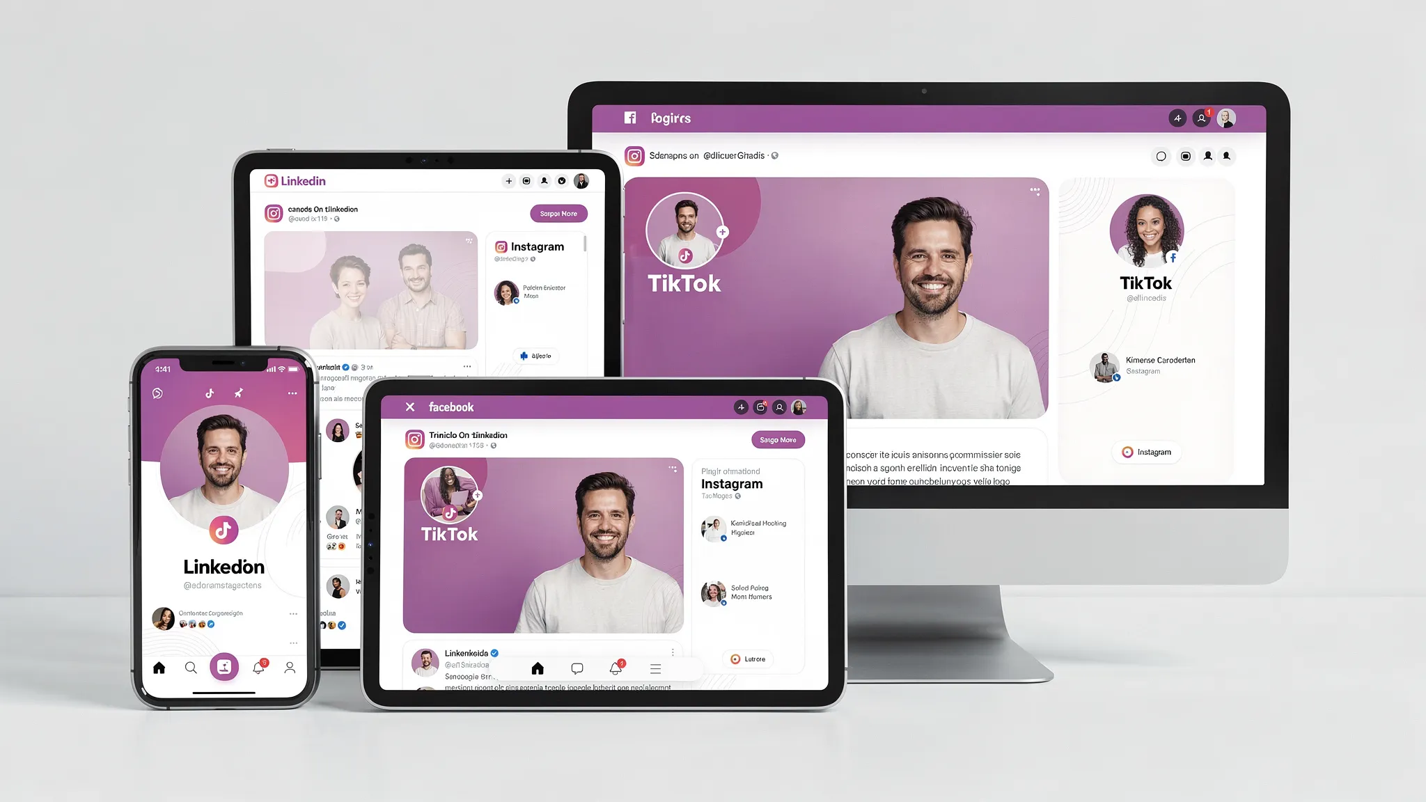
With SocialPreviewing, you can upload your profile photo (and cover images) and quickly:
- Preview across major platforms (Facebook, Instagram, TikTok, X, LinkedIn)
- Check real-time device previews
- Make instant adjustments and cropping tweaks
- Compare versions side by side (for example, brand-color vs neutral)
- Export mockups when you need to present options to a client or team
Frequently Asked Questions
What are the best colors for profile pic backgrounds? Neutrals (off-white, light gray, charcoal) are safest for clarity. For stronger branding, use a muted version of your primary brand color or a subtle gradient within your palette.
Should I use a busy background if it shows my personality? Usually no. Use a simplified version of the scene (blur it, reduce contrast, remove bright hotspots) so your face or logo stays readable at thumbnail size.
Is it okay to use AI-generated backgrounds behind my headshot? Yes, as long as it looks natural and consistent. The biggest risks are obvious artifacts, mismatched lighting, and “too perfect” textures that feel uncanny once compressed.
Can I use the same background on every platform? You can, and it often improves recognition. Just make sure it survives each platform’s crop and thumbnail size. A background that looks great on Instagram can feel too bold or too casual on LinkedIn.
Should my profile background match my cover photo or banner? They don’t need to match exactly, but they should belong to the same visual system (shared palette, similar contrast, similar level of simplicity).
Try a background, then preview it like your audience will see it
If you’re experimenting with profile pic backgrounds, don’t guess based on how it looks in your camera roll. Upload a few background variations and preview them across platforms and devices.
Use the free preview on SocialPreviewing to test your top options, then consider the lifetime unlimited access option if you update profile visuals often for clients, campaigns, or seasonal refreshes.
.svg)
.svg)


