Instagram Profile Picture Size and Crop Tips for 2026
.svg)

Your Instagram profile picture is one of the few visuals people see before they read your bio or watch a Reel. It shows up tiny in search results, comments, DMs, Story rings, suggested accounts, and notifications. That means “looks great in my camera roll” is not the same as “reads clearly at 40 pixels wide.”
In 2026, the winning Instagram profile picture is less about perfect photography and more about predictable cropping, strong contrast, and testing across devices.
Instagram profile picture size in 2026 (what to upload for best quality)
Instagram displays profile photos as a circle, but you upload a square image. The platform then scales and compresses it depending on context.
Here’s the safest approach that consistently produces sharp results:
- Aspect ratio: 1:1 (square)
- Recommended upload resolution: 1080 x 1080 px (or larger square, exported cleanly)
- Minimum to avoid obvious pixelation: at least 320 x 320 px
- File type: JPEG for photos, PNG for logos/graphics (especially if you need crisp edges)
- Color profile: sRGB (prevents unexpected color shifts across devices)
Instagram itself doesn’t reward “huge” files here, it rewards clean, high-resolution sources that downscale well.
If you want a reference starting point for square assets, Meta’s help resources are a better long-term bet than random dimension lists that go stale.
How Instagram crops profile photos (why your edges get cut)
Even when you upload a perfectly square image, Instagram effectively applies a circular mask. Everything outside that circle will be invisible.
Two practical consequences:
- Corners are dead space. If your logo text, hair, or design elements live in the corners, they will likely be cropped.
- Your image is viewed in many sizes. The profile picture can appear large on your profile page, then extremely small in comments and DMs. Fine detail disappears fast.
In 2026, this matters more because your profile photo is seen in more “discovery” placements (suggested accounts, Reels surfaces, search results). Small-thumbnail clarity is the job.
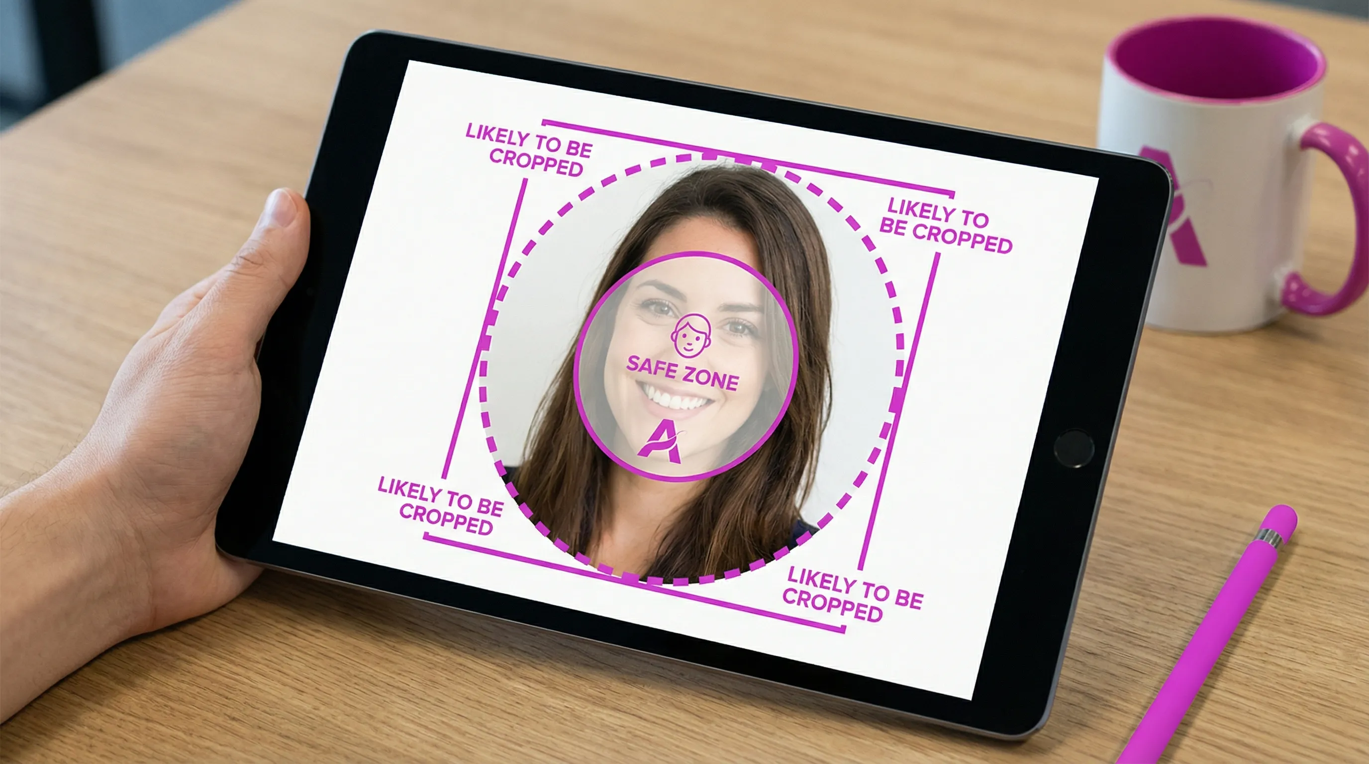
Use the “safe zone” method (the easiest crop tip that fixes most problems)
Think of your profile picture as a circle inside a square.
The best practice: keep your subject or logo inside an inner “safe” circle with padding, so it survives every crop and every UI variation.
A simple rule you can use in any editor:
- Keep the critical content (eyes, facial features, logo mark, initials) within the center 70 to 80 percent of the square.
- Leave 10 to 15 percent padding from the edges.
That padding prevents accidental cutoffs when Instagram displays your photo smaller, adds rings, or when different devices render slightly differently.
Crop tips for headshots (creators, freelancers, personal brands)
If your Instagram is tied to you (creator, consultant, designer, founder), your face is your brand mark. Cropping choices affect recognizability more than filters do.
Frame for tiny sizes, not for your camera roll
At small sizes, viewers primarily read:
- Eye contact and expression
- Strong silhouette (head and shoulders)
- Simple background
Practical crop guidance:
- Center your eyes slightly above the midpoint of the square.
- Include a bit of shoulder so the face doesn’t feel “floating.”
- Avoid crops that cut off the chin or top of hair. It can look unintentional once the circle mask is applied.
Choose backgrounds that separate you from the UI
Instagram’s interface and many profile pages are light or dark. A background that matches the interface makes your face blend in.
- If you use a light background, add separation with a slightly darker edge, jacket, or hair contrast.
- If you use a dark background, make sure facial lighting is bright enough that your features don’t disappear.
Crop tips for logos (brands, agencies, products)
Logos fail on Instagram profile pictures for one reason: they were designed to be read at large sizes.
To make a logo work in a circle thumbnail, prioritize the “mark,” not the full lockup.
Use the icon, not the full logo lockup
If your brand logo has a symbol plus small text, do not squeeze the entire thing into the circle. Use:
- The symbol alone
- A monogram/initials version
- A simplified badge version
Avoid tiny text (it won’t be readable)
Even if the text looks readable in a 1080 x 1080 export, it may be unreadable in the placements where your profile photo is most frequently seen.
If text is required, keep it to 1 to 3 characters (like initials) and use thick strokes.
Keep strokes and shapes thicker than you think
Thin lines can disappear after compression and downscaling. If you’re exporting a vector logo to PNG:
- Increase stroke weight
- Remove hairline details
- Increase spacing between elements
Make it pop in search, comments, and DMs (contrast and simplicity win)
Many people optimize their profile photo for the profile page, but the most common views are often:
- Comment threads
- DMs
- Notifications
- Search results
These are small, fast-glance contexts. Here’s what consistently improves legibility:
- One subject: face or logo, not both
- Simple backdrop: low visual noise
- High contrast: subject clearly separated from background
- Bold color choices: not neon, just distinct
Accessibility note: higher contrast benefits everyone, including users with low vision and anyone viewing in bright sunlight.
Avoid Instagram profile picture blur (export settings that help)
Blur usually comes from one of three issues:
- Low resolution source (cropping in too far)
- Aggressive compression (exported too small, then re-compressed)
- Soft focus or motion blur in the original photo
A few practical export tips:
- Start with the highest-quality image you have, then crop down.
- Export at 1080 x 1080 even if the image will display smaller.
- Use JPEG at high quality for photos.
- Use PNG for flat graphics, logos, and text.
If your image looks slightly soft after export, a tiny amount of sharpening can help. Keep it subtle because over-sharpening creates halos that look worse after Instagram compression.
The most common Instagram profile picture crop mistakes (and quick fixes)
“My head is cut off in the circle”
Fix: zoom out and re-center. If you can’t zoom out without losing quality, you need a higher-resolution original.
“My logo looks tiny”
Fix: use the icon-only version, increase padding consistency, and remove small text.
“It looked fine on my phone but weird on desktop”
Fix: test across device previews. Desktop often makes issues like edge cutoffs and mis-centering more obvious.
“The background is distracting”
Fix: simplify. Blur the background slightly, use a solid color, or remove it entirely and replace with a brand color.
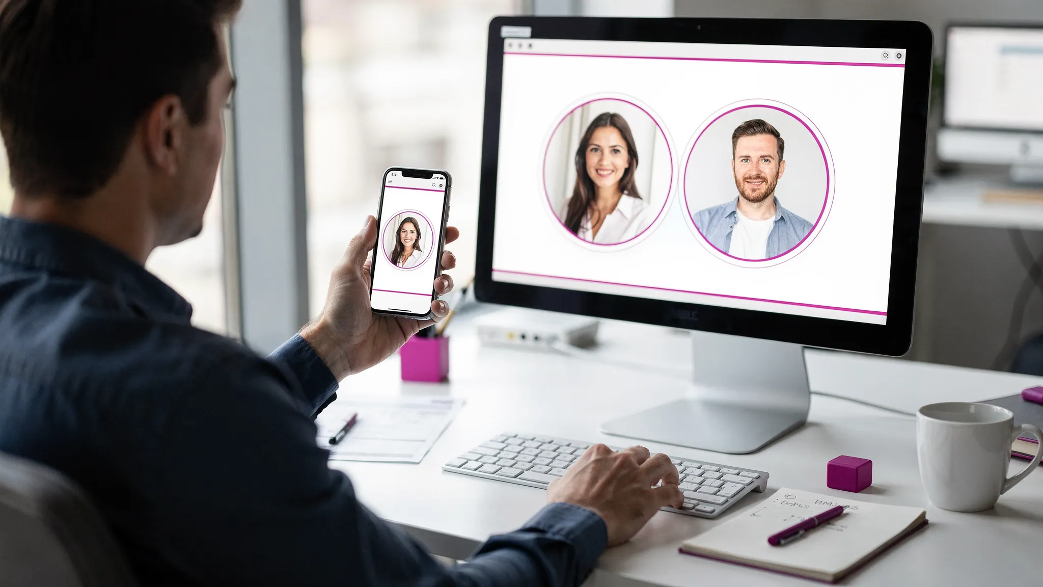
Test before you publish (the fastest way to stop crop surprises)
Even if you follow every guideline, you still have one problem: you cannot control where people see your profile photo.
That’s why previewing is part of a modern workflow. You want to confirm:
- How the circular crop looks at different sizes
- Whether the face/logo stays centered
- Whether contrast holds up in small thumbnails
With Social Previewing, you can upload your image and preview how your profile picture (and cover images) appear across major platforms and device types. This is especially useful if you’re maintaining consistent branding across Instagram, TikTok, X, LinkedIn, and Facebook.
A practical way to use it for Instagram:
- Upload your candidate profile photo.
- Adjust cropping until the face/logo sits comfortably inside the safe zone.
- Compare versions side by side (for example: neutral background vs brand color background).
- Export mockups if you need to get approval from a client or team.
This is the same reason designers mock up logos on real surfaces. The context changes everything.
A 2026-ready checklist for your Instagram profile picture
Before you upload, run through this quick list:
- Square image, exported cleanly (ideally 1080 x 1080)
- Subject or logo centered with 10 to 15 percent padding
- No important details in the corners
- Strong contrast against light and dark backgrounds
- No tiny text
- Looks good at small sizes (simulate by zooming out or using a preview tool)
- Consistent with your brand across other platforms
If your profile picture passes those checks, you’re not just “meeting the size requirement.” You’re designing for how Instagram is actually used in 2026: fast discovery, small thumbnails, and constant cross-device viewing.
.svg)
.svg)


.svg)


