Best Photo for Cover Photo on Facebook (With Safe Zones)
.svg)

A Facebook cover photo is one of the first things people see when they land on your profile or Page. But it is also one of the easiest places to lose credibility fast, because Facebook crops differently on desktop vs mobile, and key details (like faces, logos, and text) get chopped off all the time.
This guide helps you pick the best photo for cover photo on Facebook, and design it using safe zones so it looks intentional everywhere.
What makes the best photo for cover photo on Facebook?
The “best” cover photo is the one that communicates something useful in under a second, even on a small phone screen.
A strong Facebook cover photo usually does three jobs:
- Sets context: who you are, what you do, what your Page is about.
- Supports recognition: consistent colors, style, or brand cues people already associate with you.
- Leaves room for UI and cropping: Facebook overlays buttons and crops edges depending on device.
If you are a creator, freelancer, or marketer, think of your cover as a lightweight billboard: it should reinforce your positioning without requiring people to read a paragraph.
Facebook cover photo sizes (what to design for in 2026)
Facebook updates UI often, but the underlying cover photo behavior has stayed fairly consistent: desktop and mobile show different aspect ratios, so a single “perfect” size is not enough. You need a size plus safe zones.
Facebook’s Help Center has long recommended cover photo dimensions around 851 x 315 px for profiles and 820 x 312 px for Pages on desktop (display sizes can differ from what you upload). You can verify the latest guidance in the Facebook Help Center.
Here is the practical way designers handle it:
Use a working canvas that survives both crops
Design your cover on an 820 x 360 px canvas (or double it for sharpness, like 1640 x 720). Why 820 x 360?
- Desktop commonly displays a cover at 820 x 312, which effectively crops some height.
- Mobile commonly displays closer to 640 x 360, which effectively crops the left and right sides.
Using 820 x 360 gives you a single canvas that you can “safe-zone” for both.
File type tips (so it stays crisp)
- Use PNG if you have text, logos, or sharp graphic edges.
- Use JPG for photographic covers with lots of gradients.
- Export in sRGB (standard for web).
- Avoid tiny files that Facebook has to upscale. Start large and downscale with intention.
Facebook will compress images, so a clean export matters.
Facebook cover photo safe zones (the part you can trust)
Safe zones are the areas that stay visible after Facebook crops for different devices.
The universal safe zone: keep important content in the center
If you design on an 820 x 360 px canvas, the “seen on both desktop and mobile” safe zone is approximately:
- 640 x 312 px, centered
This works because:
- Mobile tends to crop the sides (showing a narrower width).
- Desktop tends to crop top and bottom (showing a shorter height).
So the intersection (what both devices share) is roughly 640 wide and 312 tall, centered.
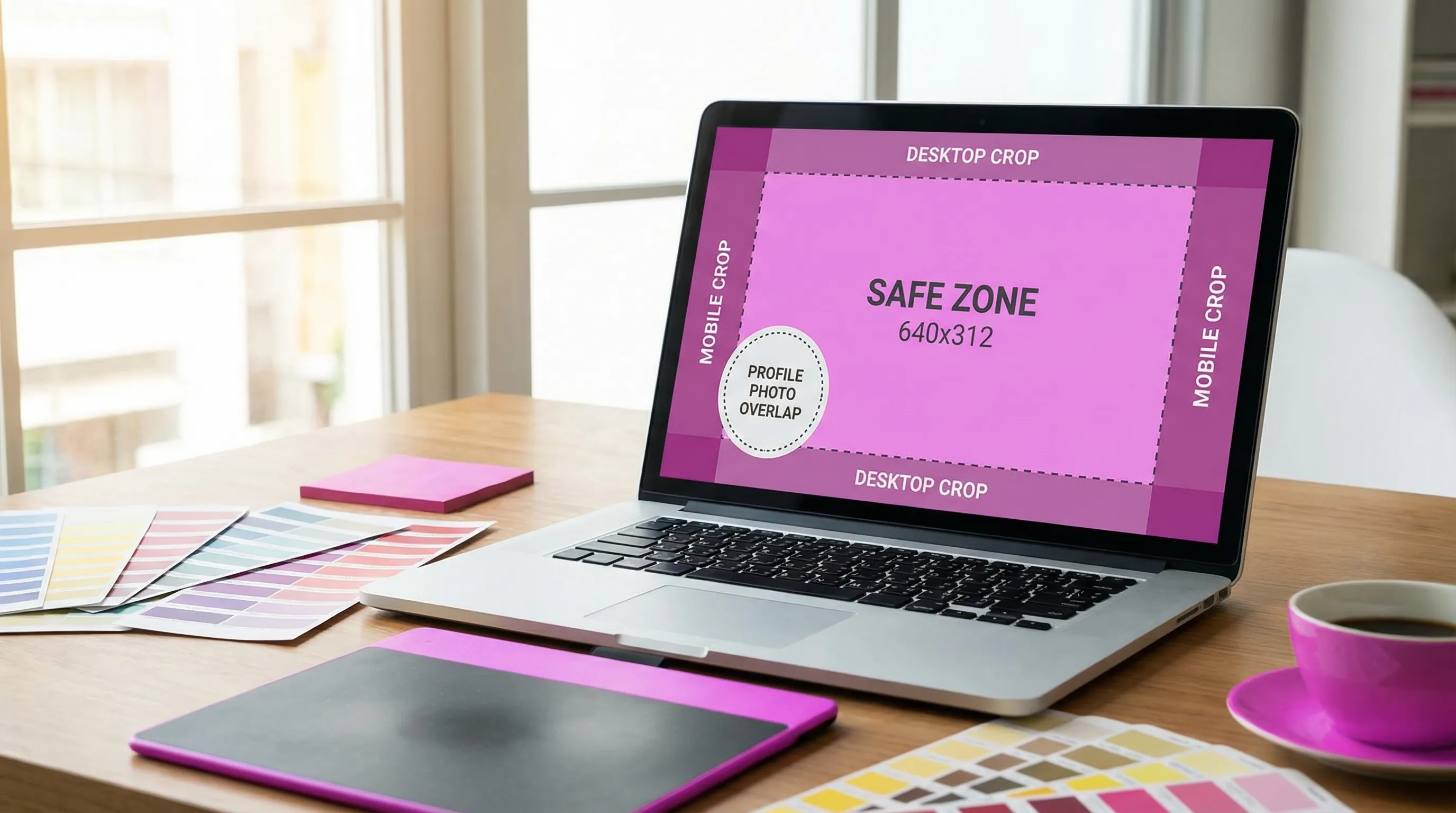
The profile photo overlap zone: protect the bottom-left
On many profiles and Pages, the profile picture overlaps the cover near the bottom-left area on desktop layouts. The exact overlay varies by UI and device, but the design rule stays the same:
- Do not place faces, logos, or key text in the bottom-left corner.
- Leave extra breathing room along the bottom edge where UI elements and buttons can appear.
If you must place branding, prefer:
- Centered within the safe zone, or
- Top-right area (still inside the safe zone), where overlap is less likely
Because Facebook’s layout can change, treat safe zones as a baseline, and always preview before publishing.
What to use as your cover photo: proven options that look good (and crop safely)
Below are cover-photo formats that consistently work for brands, creators, and professionals.
1) A lifestyle “in-context” photo
A strong lifestyle cover shows you (or your product) in the environment where the value happens.
Examples:
- A designer at a desk with a moodboard (with plenty of negative space).
- A fitness coach outdoors with open sky above (sky becomes a natural safe-zone buffer).
Why it works: it communicates quickly, and it naturally has empty areas where cropping is forgiving.
2) A brand color background with a simple headline
If you want clarity and consistency, use a solid or gradient brand background and one short line of text.
Keep text minimal because:
- Mobile screens shrink it fast.
- Cropping can cut off the first or last words if you get too close to edges.
A good rule: one promise, one audience.
3) A product or service “hero” shot
Great for Pages that sell something. Use a single product shot or a clean collage, but avoid packing too many items.
Design tips:
- Place the product slightly right of center.
- Keep the left side quieter to avoid profile-photo overlap.
4) A team or founder photo (with space above heads)
People connect with people, but team covers often crop poorly because heads sit near the top edge.
If you choose a team photo:
- Make sure there is extra space above everyone’s heads.
- Keep the group within the center safe zone.
- Avoid tiny faces. If faces are small, it reads as visual clutter.
5) A portfolio-style montage (only if it stays readable)
This works well for photographers, illustrators, and agencies. The key is restraint.
To keep it clean:
- Use 3 to 6 images maximum.
- Keep consistent color grading.
- Do not add small captions under each image (they will be unreadable on mobile).
6) A seasonal or campaign cover (with a built-in expiry)
Seasonal covers can boost relevance, especially for promos and launches.
Examples:
- “Now booking 2026 weddings” for photographers.
- A Black Friday campaign cover.
Make sure the campaign text stays in the safe zone, and update it when the campaign ends.
7) A “minimal texture” background that makes your profile picture pop
Sometimes the best cover photo is intentionally subtle.
Use:
- soft gradients
- blurred bokeh
- abstract texture
This is perfect if your profile picture carries the identity, and the cover is meant to support it without competing.
Composition rules that prevent ugly crops
Even with the right pixel sizes, composition determines whether your cover survives cropping.
Prioritize the center, not the corners
Treat the center safe zone as your stage. If your best detail is in the corners, Facebook will punish you on mobile.
Avoid placing text near the edges
Edge padding is your friend. Leave generous margin around text.
If you are designing for a client, an easy approval trick is to show them two versions:
- A “clean” version with plenty of padding
- A “tight” version
Nine times out of ten, the clean one performs better because it looks more professional on mobile.
Use negative space intentionally
Negative space is not wasted space. It is what makes a cover feel premium and readable.
If you want the cover to feel more expensive and less “template,” reduce the number of elements before you add effects.
Keep contrast high (but not harsh)
If you include text:
- Place it over a darker or simpler area of the image.
- Use subtle overlays instead of heavy drop shadows.
Accessibility bonus: higher contrast improves readability for more users.
A simple workflow to create a Facebook cover photo that looks right everywhere
Here is a repeatable process you can use for yourself or clients.
Start with the end goal
Decide what the cover is for:
- Brand positioning (who you are)
- Conversion (book a call, visit a site)
- Proof (featured in, testimonials, milestone)
- Campaign (promo or launch)
Trying to do all of these at once usually creates clutter.
Design on a safe canvas
Create your cover at 820 x 360 px (or 1640 x 720 for sharper exports), then build around the center safe zone.
Place key elements inside the safe zone
Put:
- faces
- logos
- key text
inside the centered safe zone (roughly 640 x 312 on an 820 x 360 canvas).
Export cleanly
Export PNG for text-heavy designs, JPG for photo-heavy designs. Keep it crisp and avoid repeated re-exports.
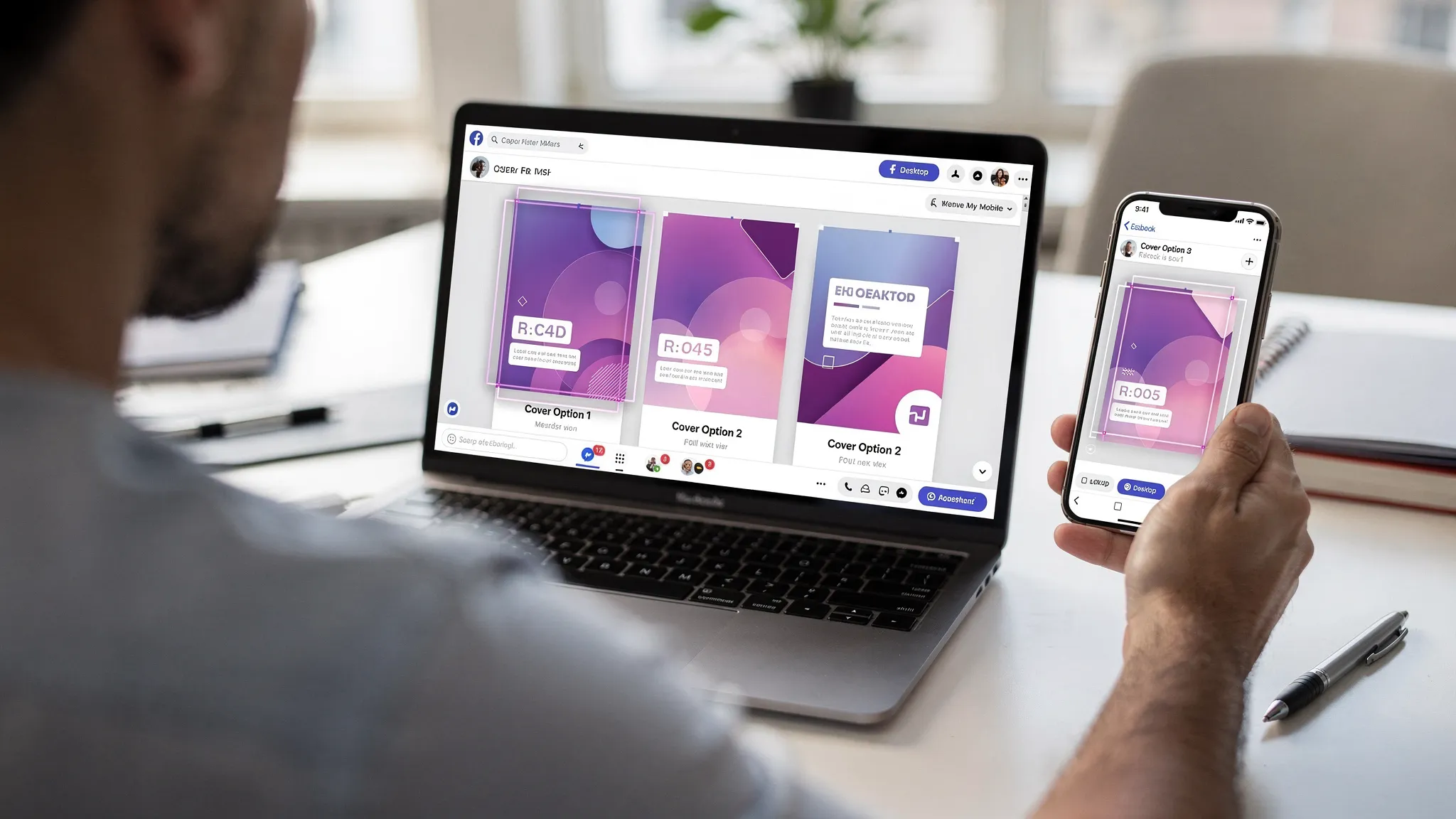
Upload and check on both mobile and desktop
Even if your template is perfect, Facebook UI changes, device screens differ, and compression can surprise you.
The fastest way to confirm your safe zones: preview before you publish
Designing a cover photo without previewing is like shipping a website without testing responsive breakpoints.
With Social Previewing, you can upload your cover image (and profile picture) and preview how it appears across major platforms and devices before you publish. This is especially useful when:
- Your cover includes any text at all
- You are aligning a cover with a profile photo (brand consistency)
- You need to export mockups for client approval
- You are testing multiple options side by side
If you want to tighten your overall profile visuals beyond Facebook, you may also like the site’s guide on how previewing can fit into your social media workflow and the broader tips in how to strengthen your social image across every platform.
Quick “do this, not that” checklist
Before you finalize your photo for cover photo on Facebook, do a last pass:
- Do use a high-resolution image with a simple focal point.
- Do keep faces, logos, and text inside the center safe zone.
- Do leave the bottom-left area clear to avoid profile-photo overlap.
- Do preview on mobile and desktop.
- Do not place important text in the far left or far right edges.
- Do not use a busy group photo where faces become tiny.
- Do not rely on Facebook to crop “smartly.”
If you only remember one thing
The best Facebook cover photo is not just a great-looking image, it is an image designed for cropping.
Start with an 820 x 360 canvas, keep the essentials inside the centered safe zone (roughly 640 x 312), protect the bottom-left overlap area, and preview across devices before you hit save.
.svg)
.svg)


.svg)


